Back in September, I attended the UCLA Mobile Web Framework conference. This was a group of about 100 UC and CSU folks gathered for two days to talk about the MWF and its direction.
I was brand new to the notion of MWF. We'd been looking at adopting it as a strategic direction for our campus mobile strategy, so I wanted to learn more about it for a management perspective and see what and how I could adapt it to our Drupal work.
When I returned home, I grabbed a copy of the MWF and setup a hosting environment so that I had a server to point at and pull down the libraries. I found a Quick Start Guide on MWF being used at UC San Francisco quite helpful.
I then installed a Drupal 7 MWF theme created by Shawn DeArmond, into a vanilla Drupal 7 site to see what happened. Magic happened. My Drupal site of an existing OpenLayers map, suddenly was mobilized. It understood gestures and acted natively versus displaying the web pages in the Safari browser (non-native, no gestures).
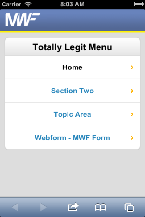
Here's a screen shot of a Drupal Primary Menu using the MWF theme. It's a basic button-based mobile main menu design pattern. I'm also using a Drupal page--front.tpl.php to display this home page.
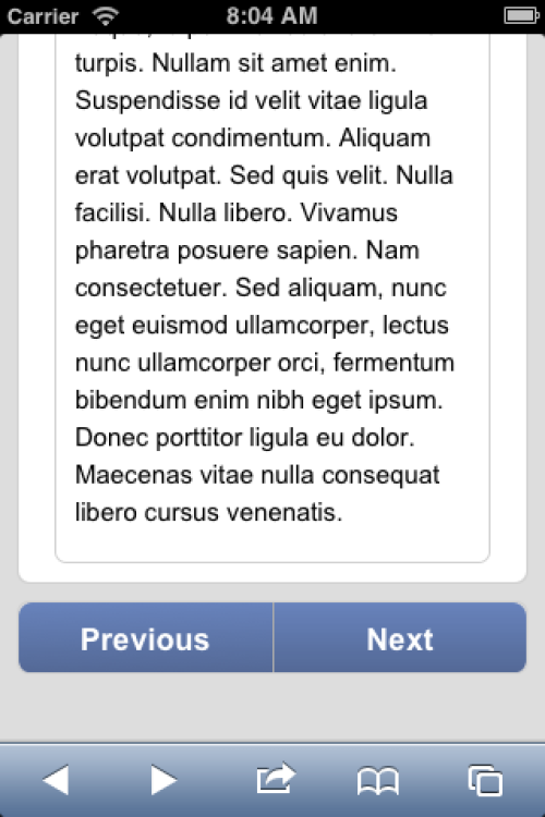
I installed a module called Previous/Next API. This allowed me to wire up the default MWF navigation buttons to a Drupal content type. This allows us to navigate through a set of content based on node id. Not ideal, but it gives us an idea of some possibilities. I also created a content type tpl.php file for this
I then installed a copy of the Webform module to work on a mobile use case. In this example, we're trying to prototype a data collection form used in the field by someone with a mobile phone. The use case calls for collecting First, Last, LatLng, and quality of service info.
Upon clicking the Webform button in the Main Menu, the user is prompted to provide the app permission to gather their geolocation information which then is used to populate the form fields.
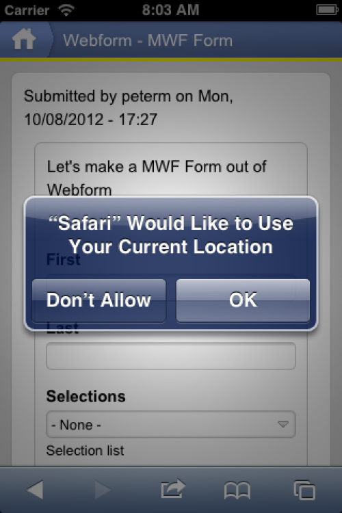
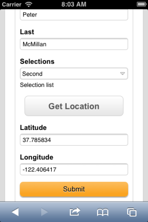
In this Webform example, we are calling the MWF geolocation library (which isn't typically included in a page build). There is also a snipped of jQuery used to copy the latlng data into the appropriate fields. Again, we are using a webform-form-8.tpl.php template to theme the form and handle our includes for geolocation.
Moving Towards WeBlocks via Bootstrap
UCLA is migrating their efforts from the MWF development to WebBlocks. WebBlocks is a toolkit that facilitates the rapid development of responsive, aesthetic and modern web applications. This framework integrates a number of existing web packages and extends them with additional functionality.
While WebBlocks is still in development, I wanted to get some experience with mobile and responsive design principles. Twitter's Bootstrap framework will be a core part of WebBlocks, so I started looking for Drupal themes that had implemented Bootstrap so I could figure out how it worked.
In my research, I came across a project from Stanford University that implements the Bootstrap framework as a Drupal theme. The proejct is Open Framework. My use case was to take the existing Drupal based Campus Map and make it responsive. It would need to work on mobile, resize itself, etc. Stanford has done some excellent work in documenting their approach and Open Framework and how they've implemented Bootstrap.
Along the way, I also read a few books on mobile and responsive. They seem to be the de-facto standards. Mobile First, http://www.abookapart.com/products/mobile-first by Luke Wroblewski is the reference on how to approach structuring content; understanding navigation and how people use their phones. Responsive Web Design, http://www.abookapart.com/products/responsive-web-design by Ethan Marcotte provides definition and formulas and CSS techniques that help us understand what and how responsive web sites should work.
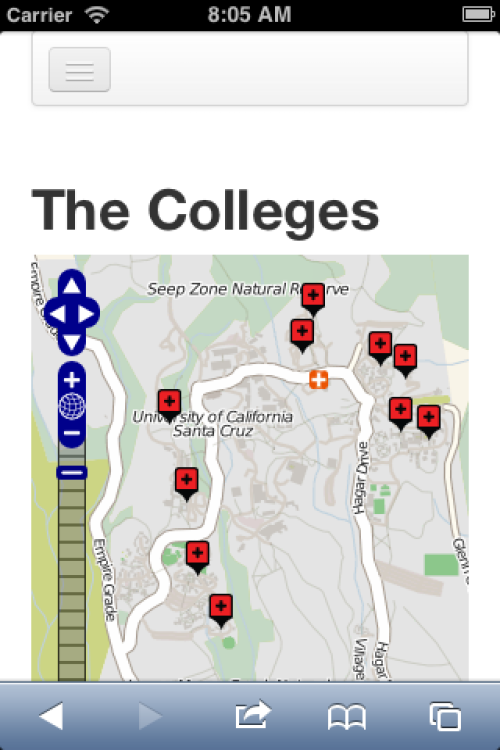
This first screen shot shows us a single column layout of the campus map. Note the gripper icon at the top left, the hidden browser chrome and the map popups.
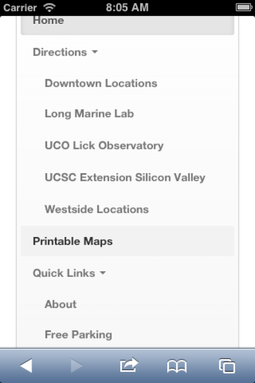
In the screen shot above we see the primary menu with its nested items displayed with in the single column used on the phone.
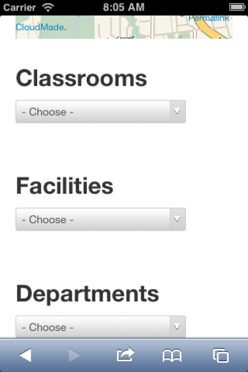
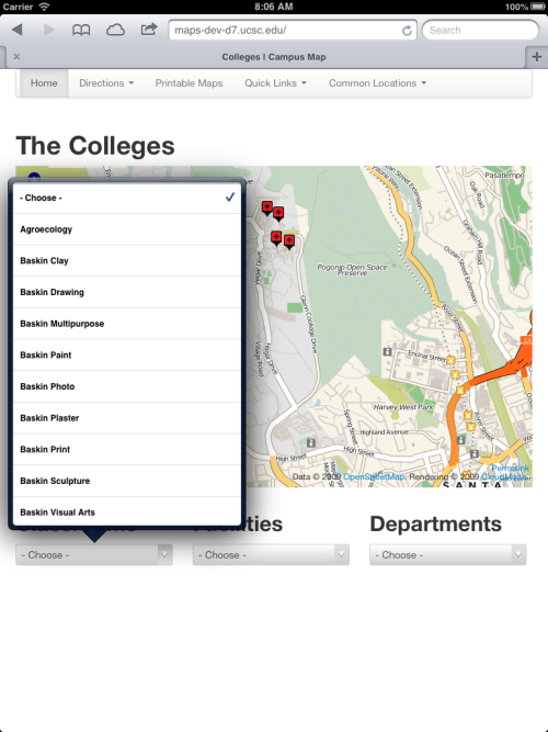
In the shot below, you'll note that we've moved into the iPad portrait-sized view, complete with browser chrome. The select list items are shown fully expanded. What's missing here is additional content blocks and content that would normally be displayed as the amount of screen real estate increases.
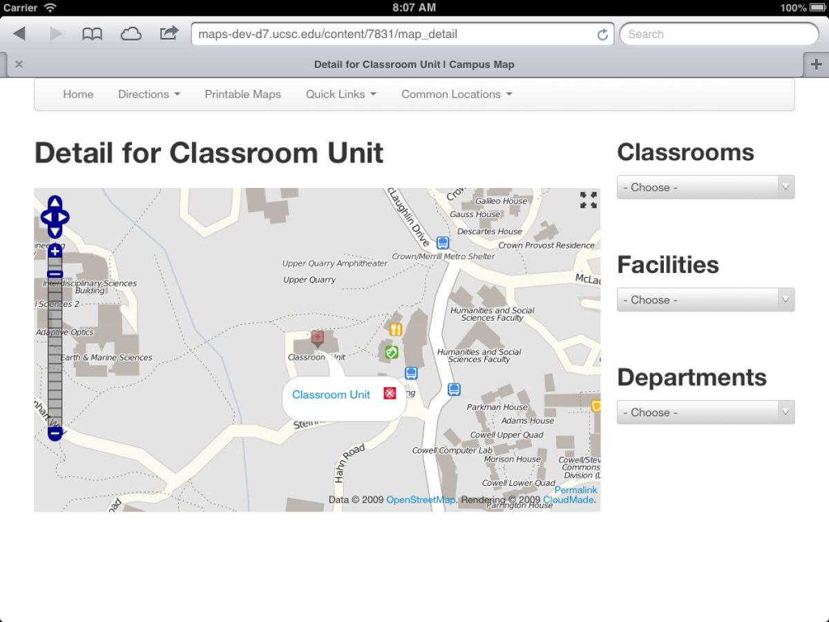
Finally, we see the detail in an iPad sized landscape view with a popup I've clicked on for Classroom Unit. Note how the selection blocks have moved to the right column as the width of the screen increased.
What's Next?
I'm planning on studying the Stanford work since it well thought through. As Web Blocks moves towards a release, I'll be working with that team on the system wide pilot and getting a few sample apps up and running. Lot's to learn between meetings.
Resources
UCLA Mobile Web Framework, https://github.com/ucla/mwf/wiki
Drupal MWF Theme by Shawn DeArmond,
Stanford University Open Framework, https://openframework.stanford.edu
Books
Mobile First, Luke Wroblewski
Responsive Web Design, Ethan Marcotte
Mobile Design Pattern Gallery, Theresa Neil
jQuery Mobile First Look, Giulio Bai
Developing Mobile Apps, Earle Castledine, Myles Eftos, Max Wheeler
jQuery Mobie Web Development Essentials, Raymond Camden, Andy Matthews